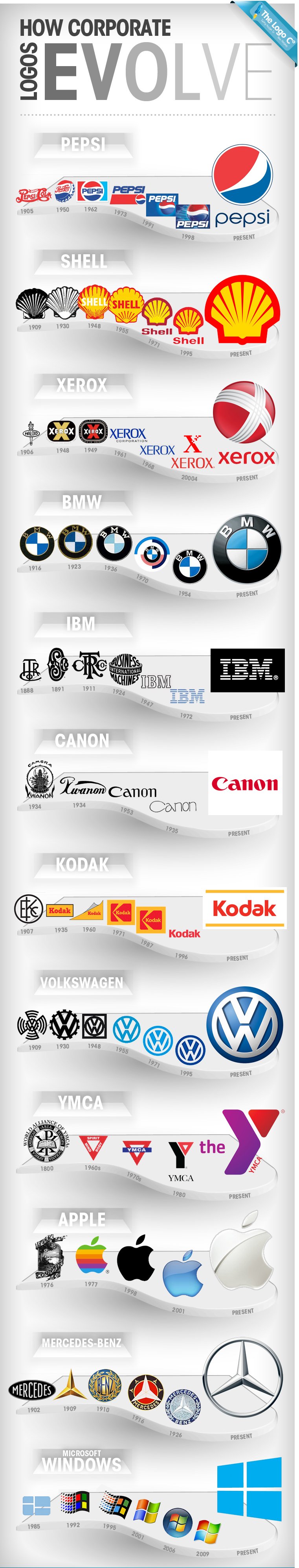
The text details the evolution of corporate logos over the years, showcasing how some of the world's most recognizable brands have updated their logos to reflect changes in design trends and corporate identity. Here's a breakdown of the evolution of each brand's logo:
Pepsi: Starting from 1905, the Pepsi logo has undergone several redesigns, from intricate script text to the more streamlined and modern versions. The evolution includes significant changes in 1950, 1962, 1973, 1991, 1998, and the present-day logo.
Shell: Shell's logo dates back to 1909 and has evolved from a detailed shell illustration to a more stylized and simplified version. The changes happened in 1930, 1948, 1955, 1971, 1995, and the current design.
Xerox: Beginning in 1906 as Haloid, the Xerox logo transformed significantly, especially from 1948 onwards, reflecting its shift from a photographic paper supplier to a major photocopying corporation. Key redesigns were in 1949, 1961, 1968, 2004, and the present logo.
BMW: BMW's logo has remained relatively consistent since 1916, featuring the iconic Bavarian flag colors and circular design. Notable changes occurred in 1923, 1936, 1954, 1970, and the present version.
IBM: IBM's logo, starting in 1888, has evolved from ornate and classical to the simple, striped design introduced in 1972, symbolizing speed and dynamism. Key changes were in 1891, 1911, 1924, 1947, 1972, and the current logo.
Canon: Originally named 'Kwanon' in 1934, Canon's logo changed to 'Canon' in 1935, with subsequent redesigns in 1953, 1971, and the current streamlined design.
Kodak: Kodak's logo has evolved from its early versions in 1907, moving through various typographic and color changes in 1935, 1960, 1971, 1987, 1996, and the present logo.
Volkswagen: Starting in 1936, the Volkswagen logo has seen several redesigns, including major changes in 1948, 1955, 1971, 1995, and the current design.
YMCA: The YMCA logo has transformed from its original design in the 1800s, through the 1960s, 1970s, 1980, to the present-day logo, reflecting its enduring community focus.
Apple: Apple's logo has dramatically changed from its first iteration in 1976 to the minimalist apple silhouette in 1998, and the current logo, signifying the brand's evolution in technology and design.
Mercedes-Benz: Since 1902, Mercedes-Benz’s logo has evolved from intricate designs to the renowned three-pointed star in a circle, symbolizing luxury and quality. Changes occurred in 1909, 1910, 1916, 1926, and the current logo.
Microsoft Windows: The Windows logo has evolved from 1992 to the present, reflecting the changes in the operating system’s interface and design philosophy. The logo saw changes in 1995, 2001, 2006, 2009, and the current design.
Each logo’s evolution reflects the changing times, design trends, and the growth and transformation of the companies themselves.